You’ve probably heard of the colour wheel before, or you’ve heard the words “complimentary colour” or “analogous colours” thrown around before.
In the design and colour world there is a very essential tool called “the colour wheel” that is used as a base to choose colour schemes for all kinds of projects, from interior design, to fashion collections, to branding and marketing materials.
The colour wheel aids us in being able to easily and readily know what works, and what won’t work.
This is a super quick, ultra light post to quickly explain what the colour wheel does and the terms surrounding it.
So let’s get to it!
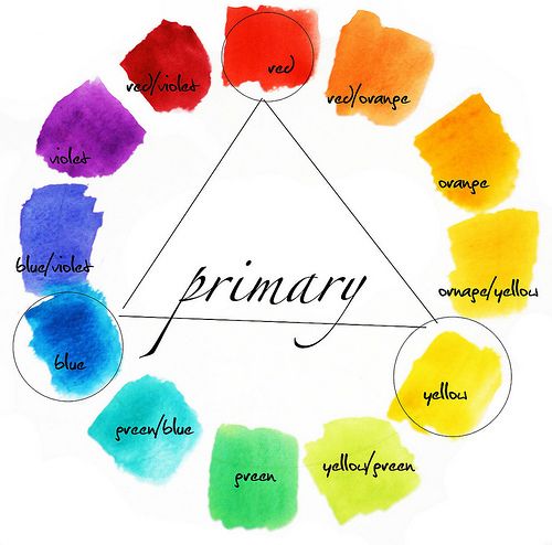
The colour wheel consists of:
Three primary colours
Red, blue, and yellow. Cannot be made from mixing other colours
Three secondary colours
Orange, Purple, and Green. Can be made by mixing the primary colours together
Six tertiary colours
The six shades that can be made from mixing primary and secondary colours.
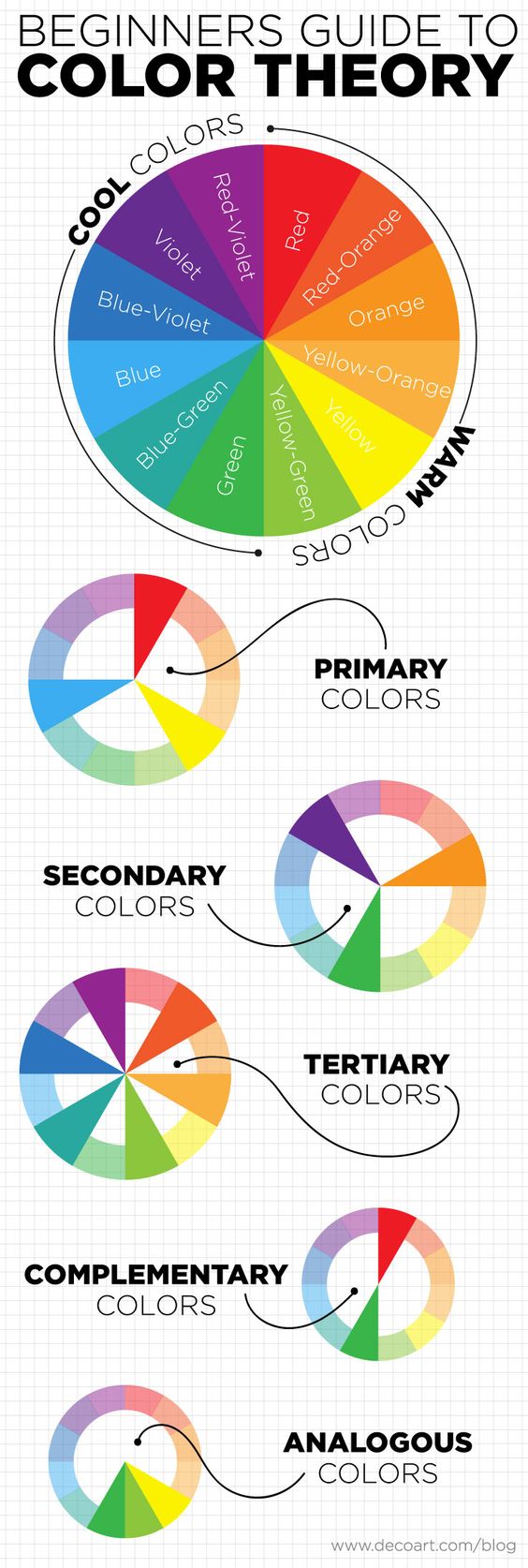
There are also tints, shades and tones:
Tint
The act of lighting a colour by adding white to it.
Shade
The act of darkening a colour by adding black.
Tone
Slightly darkening a colour by adding grey.
Any colour can be tinted, shaded and toned to turn it into a brand new colour.
And then there are the colour schemes, with 3 primary colour schemes:
Complimentary
These are colours that sit opposite each other on the colour wheel – red and green, for example.
Analogous
These are colours that sit side by side on the colour wheel.
Triadic
These are spaced evenly around the colour wheel and are usually bright and dramatic.
If you draw a line directly through the center of the colour wheel, you can also split all of the cool and warm shades.
The below image perfectly sums up all of the above (thanks DecoArt https://decoart.com/blog/article/318/color_theory_basics_the_color_wheel)
So now that we know what the colour wheel consists of, why should we be using it?
“Colour increases brand recognition by 80%” – Psychology of colour
Colour is a visual stimulant that we can all appreciate. Think about a beautiful interior you have seen, or about your favourite brands new dress or marketing campaign. The pairing of colours in any of these scenarios is probably subtle, yet so accurately executed that you thoroughly enjoyed looking at it and perhaps even made a purpose because of it.
The psychology behind colour selection has been extensively studied, and when done right, oftentimes you won’t even realise its why you love something so much. You just do.
Keep checking back for next weeks post, which will delve deeper into the psychology of colour use.
Thanks for the images:
https://www.flickr.com/photos/80985976@N00/4806959105 /
https://www.flickr.com/photos/23450806@N04/2830113819 /