3 Reasons Fabric Colours Can Print Differently and How We’re Changing That
January 25, 2024
TL;DR – We’ve invested in new software as well as machinery to make the colour matching experience faster, more accurate and greater than ever.
If you’re an interior designer, decorator, DIY-er or fabric-user of any kind, your mission is to weave art through your creations. When it comes to working with textiles, it’s so much more than fabric, it’s all about the story and experience.
Each fabric has its own metaphorical touchpoints, be it through texture, colour or pattern, giving it that distinctive identity that resonates with those who come across it. Making them, well…considerably important.
“Just how important?” You ask.
Say you’ve put time and energy into creating the perfect textile design.
Paired together into the perfect collection.
Now it’s time to pick your fabrics and print your samples!
You request a sample on a fabric that’s perfect for your cushions, upholstery and wallpaper.
When the samples arrive the colours are all different to eachother?
“Mother of pearl!”
Why!? Well, there are several reasons that colours appear different when fabric is printed, including:
1. Different printing methods, inks, and dyes
2. Different fabric compositions
3. Different fabric colours
What makes this happen?
The truth is, depending on which fabrics you chose and what their printing methods were, it is possible to end up with different printing results.
For example, using sublimation printing for polyester or synthetic fabrics is a great choice, however it is not suitable for natural fibres like cotton and linen, as these materials cannot absorb the dye. So requesting the same design across polyester and natural fibre base fabrics means they’ll be printed through different methods. Each method has varying processes and inks, all resulting in different outcomes.
It’s also important to note that different fabric compositions can have varying results due to their unique characteristics. For instance, polyesters and wallpaper bases are typically white, while natural fibres can have a soft beige tone. Additionally, a fabric with a triple weave black layer in the middle may start as a muted grey tone.
These differences in fabric composition can significantly impact the final printed colours, making it essential to consider the specific qualities of each fabric when aiming for consistent colour outcomes.
Thinking about what all of this means for your collection and how we can make sure we get all of the colours to be the same? We’ve got you covered.
At Mereton, when we’re printing fabrics, we’re helping you bring your creation to life – and that’s not something we take lightly.
Why? Because simply put, a piece of fabric is only as successful as its ability to trigger an emotion through colour, texture and quality (just like art!).
This is why we’ve invested in new software as well as machinery to make the colour matching experience faster, more accurate and greater than ever.
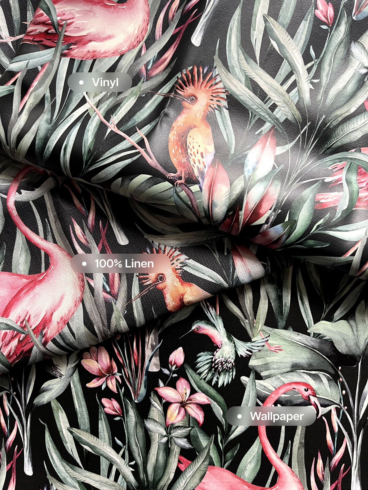
Even better? We know that each type of material uses a different printing process, inks, and machines and we wanted to make sure all our colours matched, so we checked out a bunch of different options to make it happen. Now, with our new systems in place, your colours print the same from each of our print methods: sublimation, direct to fabric, wallpaper and vinyl.
“We saw a growing amount of designers using a wide range of fabrics to build out their collections, and the need for colours to be consistent across all of them, so we listened.”
Joe Aliano (Founder / Managing Director – Mereton Textiles)
We’ve rolled out our new PF 2024 colour management system, which is hard at work matching colours across all our base fabrics and machines.
This means that whether you print a linen, or a vinyl, or a wallpaper and a polyester, they’ll come out very close in colour. While there are still some factors (like sheen) that might slightly alter the appearance, we are proud to boast a 95% colour match.
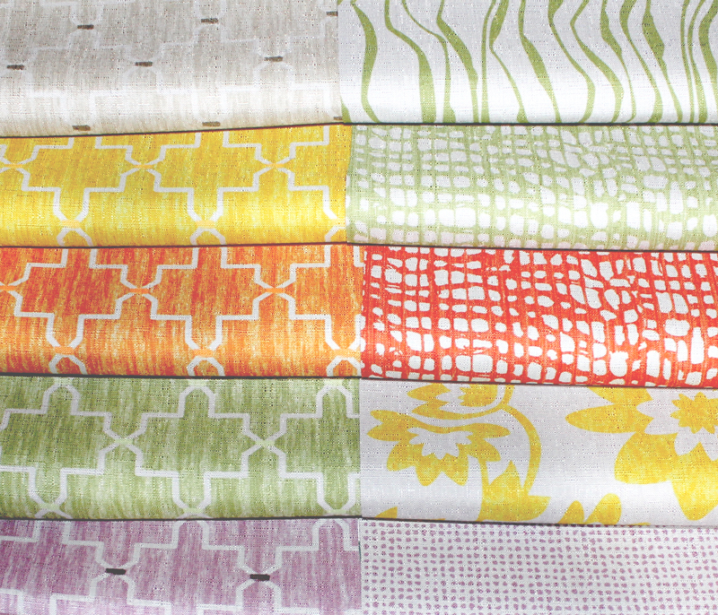
Check out the photo below for a side-by-side comparison of our Linen Look Wallpaper, Vinyl, and Nashville (100% Linen).
To experience the same colours across all of your designs, they need to be printed using the PF 2024 colour management system. Existing colours on our current system will still be available, however they will need to be moved over to PF 2024 if you want them to be consistent across the board. We can assist with this if you require it, just let us know.
Want to begin printing on fabrics, but you are not sure what print technology best suits your needs?
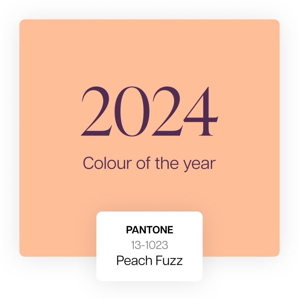
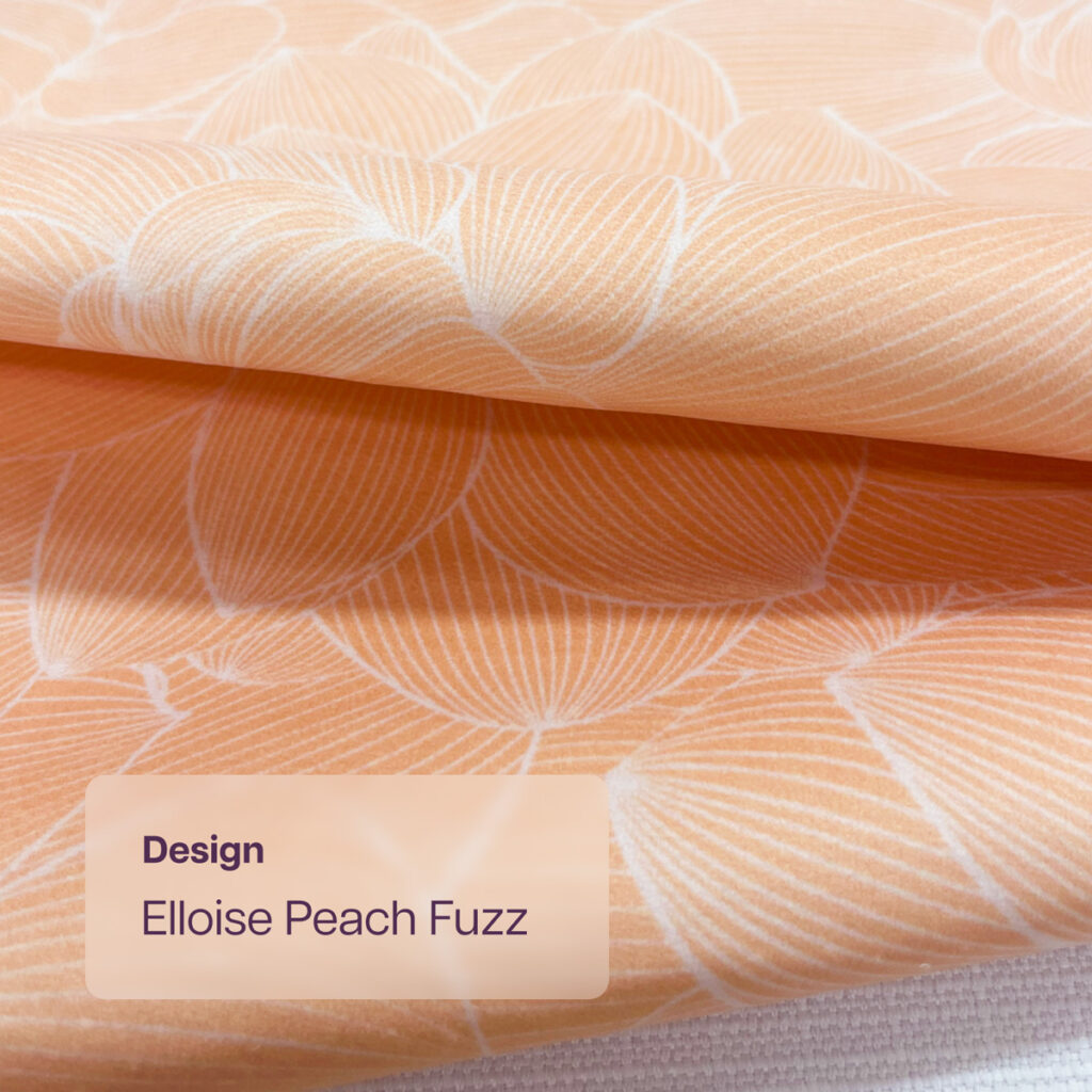
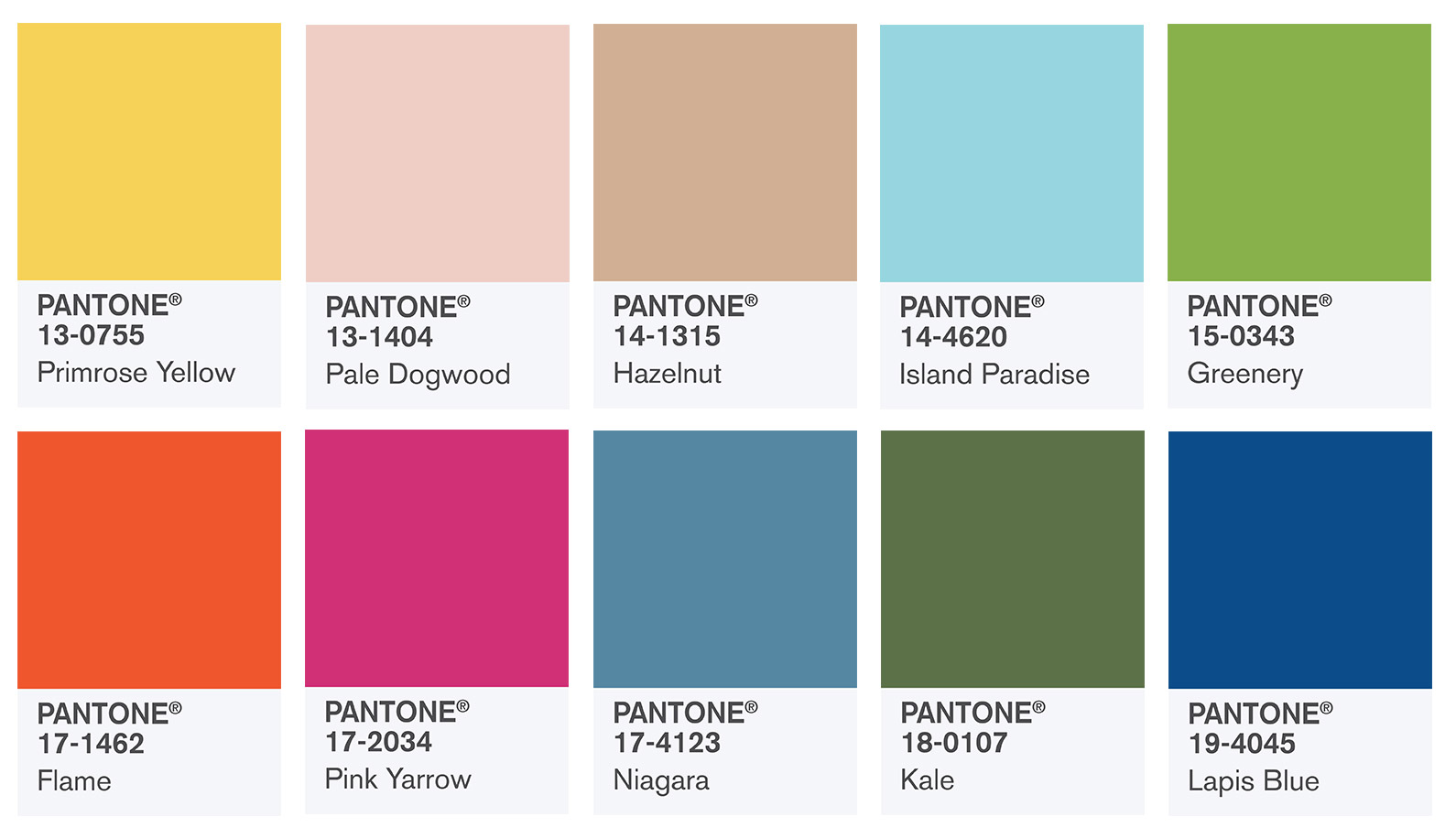
Peach Fuzz 13-1023: Embracing Pantone’s colour of the year 2024 in textiles
December 28, 2023
As creators and avid lovers of the world of textiles, we’re always attuned to the colours that shape our world. This year, Pantone has introduced Peach Fuzz 13-1023 as the Colour of the Year for 2024, a hue that encapsulates warmth, comfort, and a sense of nurturing community. But what does this mean for us, and potentially for you?
The Essence of Peach Fuzz
Peach Fuzz isn’t just a colour; it’s a feeling — a velvety gentle peach that radiates warmth and modern elegance. It represents a blend of compassion and tranquillity, bridging the gap between the youthful and the timeless. In a world of constant change and challenges, Peach Fuzz emerges as a colour of hope, togetherness, and inner peace.
Pantone Colour of The Year 2024
Why Peach Fuzz Matters
In turbulent times, Peach Fuzz stands out as a symbol of the collective yearning for closeness and human connection. It’s a colour that promotes well-being, offering a tactile embrace and a cozy sensibility. With its soft and airy presence, Peach Fuzz is here to lift spirits and inspire a future filled with compassion and empathy.
Peach Fuzz in Textile Design
Imagine fabrics that not only look stunning but also convey feelings of warmth and comfort. Peach Fuzz is perfect for creating interiors that welcome and embrace, whether on a painted wall, in home décor, or as a subtle accent in patterns. Its soothing presence can transform spaces into sanctuaries of calm and creativity.
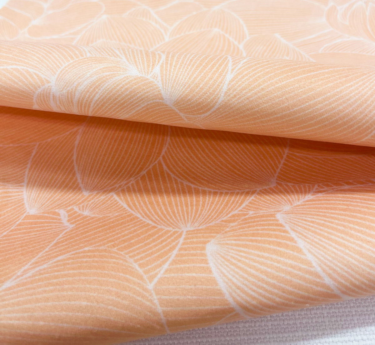
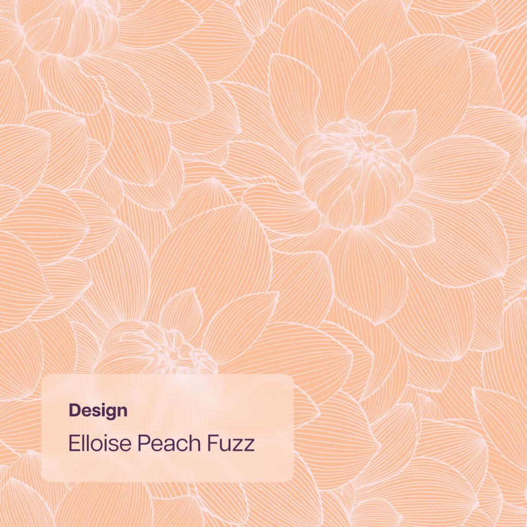
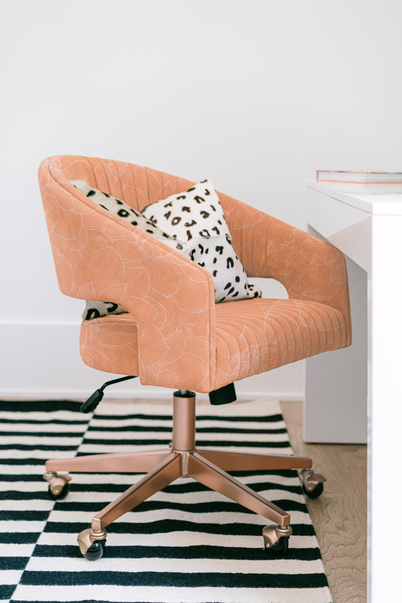
Elloise Peach Fuzz on Computer Chair
If you’re loving the way Peach Fuzz is connecting with you this season, reach out and let us know how we can help you incorporate it into your next design or sampling request.
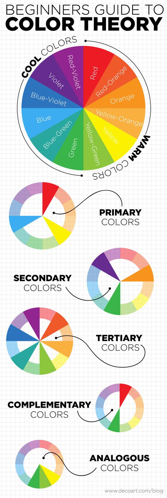
The Colour Wheel – 3 Minute Explanation
October 4, 2018
You’ve probably heard of the colour wheel before, or you’ve heard the words “complimentary colour” or “analogous colours” thrown around before.
In the design and colour world there is a very essential tool called “the colour wheel” that is used as a base to choose colour schemes for all kinds of projects, from interior design, to fashion collections, to branding and marketing materials.
The colour wheel aids us in being able to easily and readily know what works, and what won’t work.
This is a super quick, ultra light post to quickly explain what the colour wheel does and the terms surrounding it.
So let’s get to it!
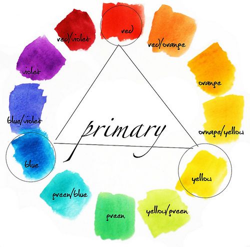
The colour wheel consists of:
Three primary colours
Red, blue, and yellow. Cannot be made from mixing other colours
Three secondary colours
Orange, Purple, and Green. Can be made by mixing the primary colours together
Six tertiary colours
The six shades that can be made from mixing primary and secondary colours.
There are also tints, shades and tones:
Tint
The act of lighting a colour by adding white to it.
Shade
The act of darkening a colour by adding black.
Tone
Slightly darkening a colour by adding grey.
Any colour can be tinted, shaded and toned to turn it into a brand new colour.
And then there are the colour schemes, with 3 primary colour schemes:
Complimentary
These are colours that sit opposite each other on the colour wheel – red and green, for example.
Analogous
These are colours that sit side by side on the colour wheel.
Triadic
These are spaced evenly around the colour wheel and are usually bright and dramatic.
If you draw a line directly through the center of the colour wheel, you can also split all of the cool and warm shades.
Colour is a visual stimulant that we can all appreciate. Think about a beautiful interior you have seen, or about your favourite brands new dress or marketing campaign. The pairing of colours in any of these scenarios is probably subtle, yet so accurately executed that you thoroughly enjoyed looking at it and perhaps even made a purpose because of it.
The psychology behind colour selection has been extensively studied, and when done right, oftentimes you won’t even realise its why you love something so much. You just do.
Keep checking back for next weeks post, which will delve deeper into the psychology of colour use.
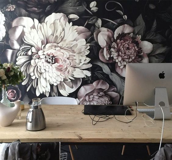
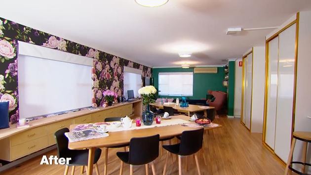
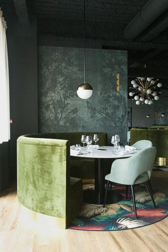
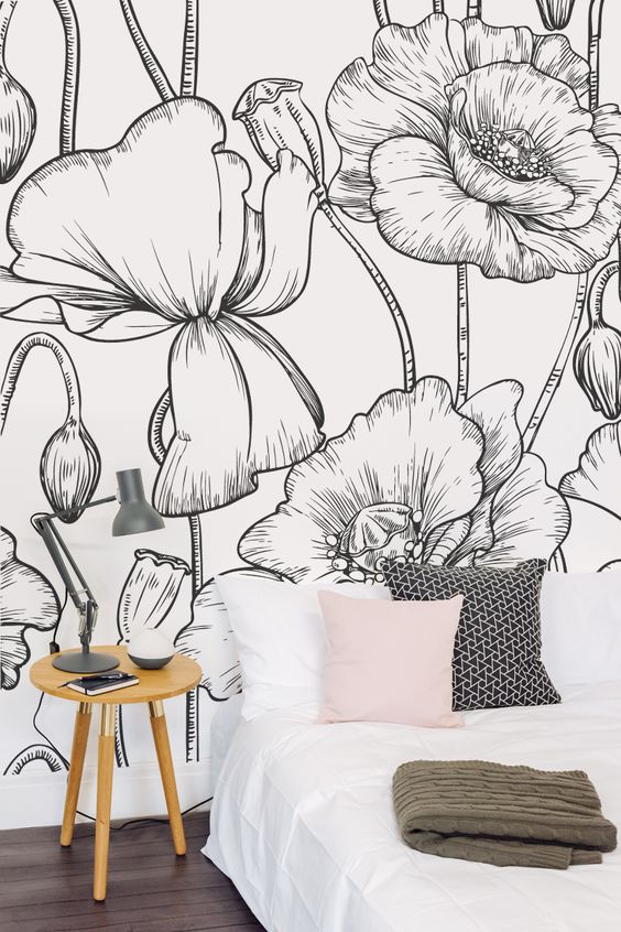
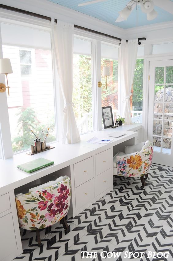
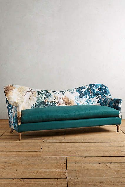
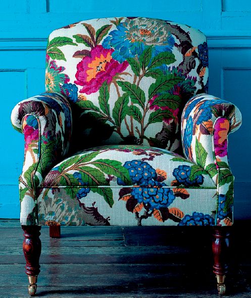
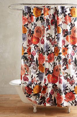
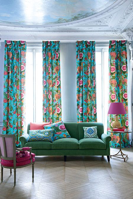
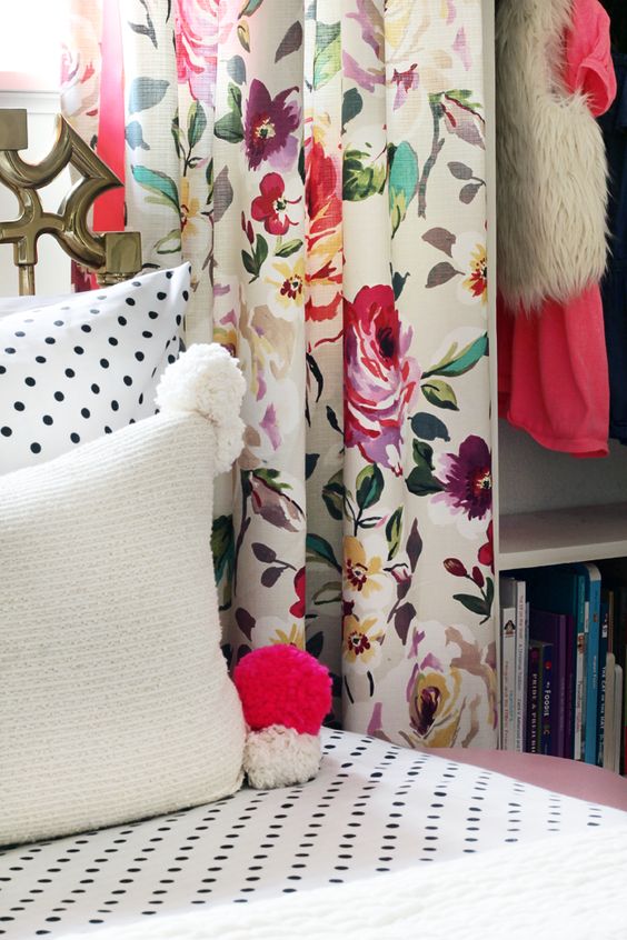
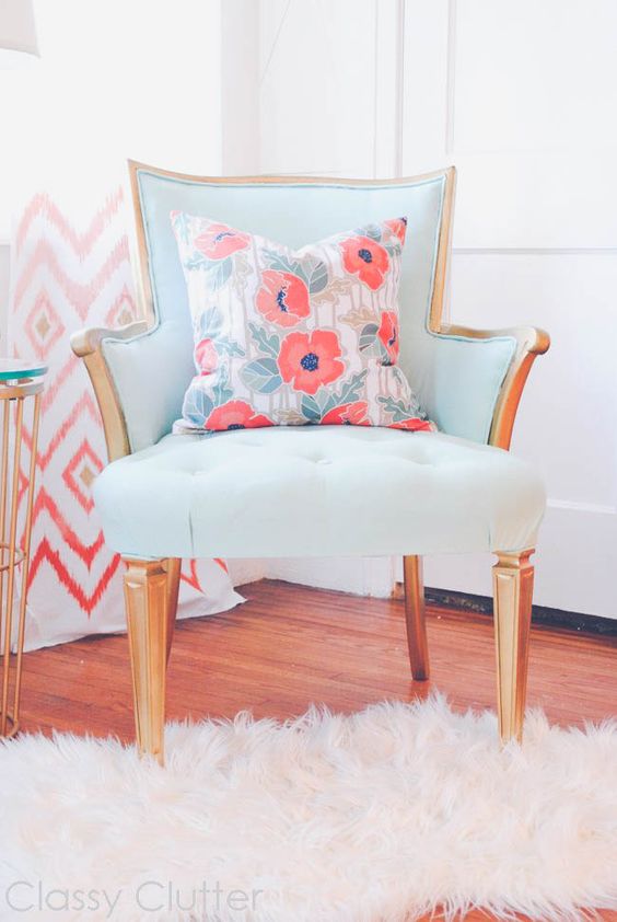
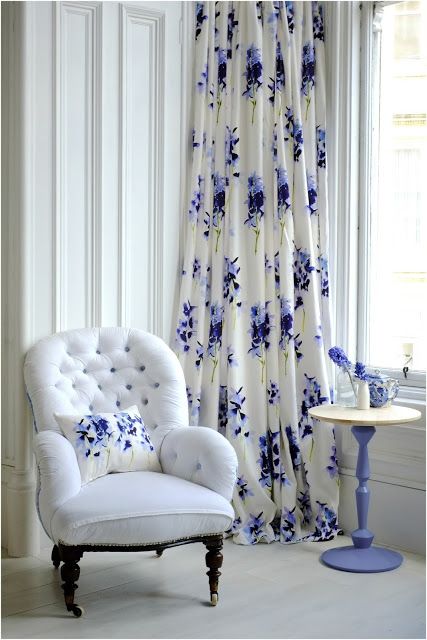
On this years season of House Rules, one of the final challenges was a charity challenge where the contestants renovated 3 individual apartments and the common areas of Bezzina House. One of the couples boldly chose a large scale floral wallpaper to adorn their zone, the main dining room.
The end result was quite impactful and got me thinking about the use of florals in interior design; florals can range so widely, from small and delicate to large and abstract manifestations.
So here is a collective of varying interiors featuring floral elements to use as inspiration for your next project! Enjoy
Our design library is full of designs that fall across many different styles; there are the highly detailed and heavily textured designs, the two dimensional ultra modern designs, classic florals, typical stripes, wild stripes and almost everything in between.
The library is a constantly growing catalogue, and the 12 latest additions fit into a whole new class of their own: hot, on-trend colours sprinkled throughout practical, commercially suitable designs.
We have found over the years that small scale, textured designs work best for commercial spaces; think hospital waiting rooms, offices, restaurant seating. The smaller the scale and more textured or detailed the design is, means that markings are less likely to be seen and designs don’t give a worn look after years and years of continuous and repetitious use.
With this in mind, our latest release of designs were specifically curated for use in commercial spaces and brought together with an on-trend colour palette of 15 colours for each design.
Colour, colour everywhere! With so many colours everywhere, how do we know which ones to use and when?
Sometimes I sit down at the computer and it all just clicks, the colours I choose just happen to fall into place and sit side by side so perfectly it needs no second thought.
Other times I sit down and stare at the screen and nothing comes to me.
If you’re stuck in one of those times, then this guide is for you! Below are 5 of the hottest colour palettes you can incrporate into your design projects now!
This stunning colour palette features rich hues paired next to even richer hues, combating the dullness typically seen in interiors over the last few years.
Rid yourself of white on white, pastels, pale timbers and soft greys and introduce yourself to a world of rich colour density.
This colour palette features pale and soft shades, emulating comfort and composure. The lighter shades can all pair together for a gently crafted scheme, or you can throw in a splash of the deeper hues to give a strong contrast.
Pantone have released their top 10 colour predictions for Fall 2017. Every season the team at Pantone attend New York Fashion week to closely assess the colours used throughout designers collections, then compile their Top 10 colours for the upcoming season.
These colours lean more to the warm side with a few key standouts to contrast. Striking and bold, these colours are the hot picks by Pantone, whom are usually right on the money with their colours!
WGSN are a leading forecaster for all things interiors, fashion, colours, textures, you name it.
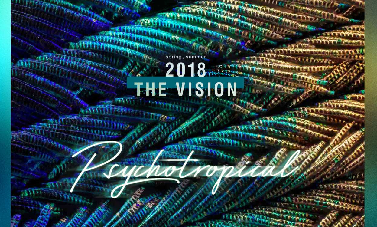
One of their key forecasts for 2017/18 is the Psychotropical trend, which contains an out-there colour palette featuring fusions of colours and prints you would usually tie together.
Bright, neon purples and pinks sit alongside deep forest greens and electric blues. Check out the Pinterest results to get a closer understanding of this incredulous palette!
The Colour Matching Process
February 15, 2017
Matching colours is one of the many services we offer to our customers. We can colour match to anything you have handy such as a swatch of fabric, a Pantone colour, a Dulux paint chip, an old cushion, you name it.
Colour matching can be done two ways; either by adjusting the CMYK values until we reach a match or by hueing a files colour tones until a match is reached.
Where a file is editable, meaning all motifs are separate objects on separate layers, we will colour matching by adjusting the CMYK values.
If a file is not editable, meaning the file has been rasterised or flattened or it is a photo then we will hue the colour tones to achieve the desired colour.
Hueing isn’t the most ideal method of colour matching as adjusting the hue on a rasterised file affects all of the colours in the file.
Here’s a run down of the colour matching process:
The colour requirement is identified – to get things started we choose a close colour from our colour chart
We print a small strike off to test the printed colour
The colour is checked under our D65 lightbox
We then tweak the CMYK values or the hue on the file
Following this we print another small strike off to confirm colour. Steps 3 and 4 can repeat many times until the colour is matched
When we think the colour is a good match visually in the lightbox we then measure the colour compared to the original with our colourspectrophotometer tool
The tool will tell us how close we are with a number rating, anything from 0.1 to 0.9 is considered a close match
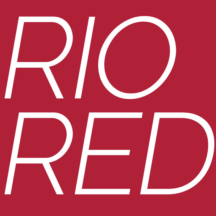
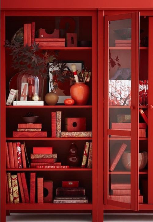
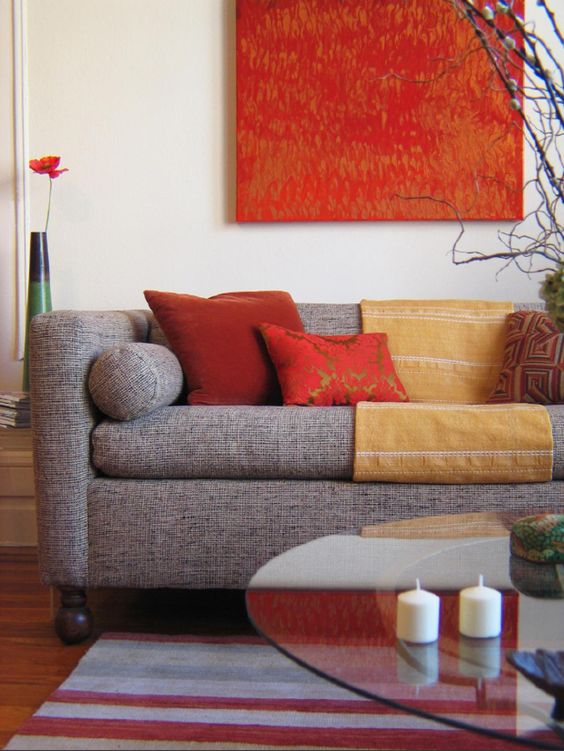
Rio Red is THE Red
February 7, 2017
Red, who doesn’t love red? A colour so vivacious that it takes on many forms.
Red can be seen through oriental styling, ultra modern looks and even contemporary design – it all depends on the shade.
Rio Red leans slightly toward a darker, more tonally cool hue of the classic red, making this strikingly bold colour a stand our feature, shining on its own beautiful merit.
This colour is set to be a big hit through soft furnishings in 2017!
View our gallery below for some inspirational ideas on how to use this feature colour
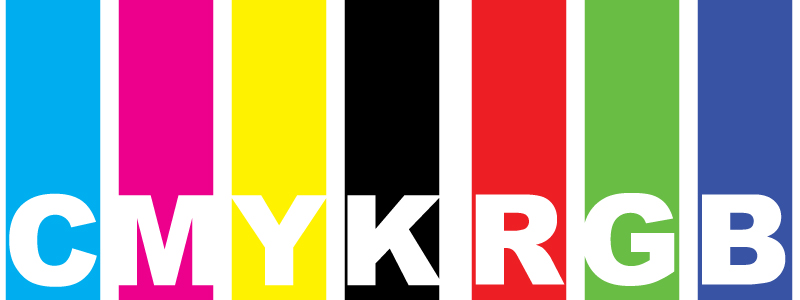
Since the beginning of printing anything, there has been a lingering question: CMYK or RGB?
Which colour space should I use?
To reach an answer on which one to use, we first must understand each colour space and what they are designed to do.
This post will help you to understand how CMYK and RGB work, what they are intended to do and where they will best be used.
CMYK
CMYK stands for Cyan, Magenta, Yellow and BlacK.
CMYK is what is known as a ‘subtractive’ colour space. It is considered subtractive as CMYK works on the principal that you start with white and then add colour, removing the light. If all colours are added at full capacity you end up with the darkest colour, black and have completely subtracted the light (white).
CMYK is used in most printing processes such as dye sublimation, paper printing, screen printing etc.
RGB
RGB stands for Red, Green, Blue.
RGB is an ‘additive’ colour space, as you begin with black (darkness) and add light to reveal the visible colours. If all of the light has been added then you have produced white by completely eliminating the darkness.
RGB is used in digital applications such as computer monitors, screens, websites, cameras etc.
So, which one?
With this information in mind, it now comes down to your application: Print or Digital?
Digital applications such as computer screens and websites use RGB colouring as these use light to create their colour, which is a perfect fit with RGB. RGB will display beautifully and vividly on screens.
Printing applications such as dye sublimation and paper printing mostly use CMYK colour space files as the inks used are physically CMYK inks. These printers begin with a white fabric base or white paper stock and the colour is then added to it, making it a perfect fit with the CMYK process.
The best thing to do would be to contact your printer to confirm their preferred colour space as some printers do print RGB files as well, depending on their setup.
At Mereton we recommend creating your files in CMYK as this will give you the most accurate results when printing.
As screens display in RGB regardless of the colour space you choose for your files, it is always recommended to order a sample prior to ordering as going by what you see on screen won’t necessarily be the same as what you see when it is printed onto fabric.
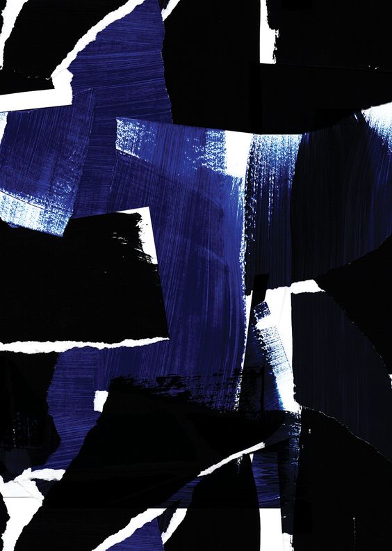
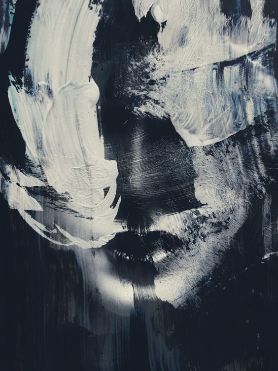
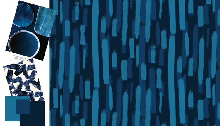
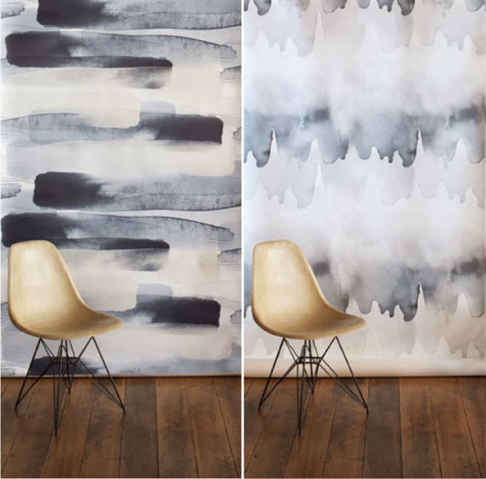
Trend Alert: Brush Strokes
January 19, 2017
There is nothing I love more than a well done, textured design. Texture is the extra element that can turn something from completely flat looking into a beautiful, multi dimensional design.
This year we are seeing a big movement toward the brush stroke texture effect.
Long strokes with a painterly flick at the finish, separated with negative space or short strokes overlapping more short strokes with the same vigor – whichever way the brush stoke is done, it’s all the rage this year.
Team this painterly effect with strong and deep colour tones for a dramatic and modern look.