TL;DR – We’ve invested in new software as well as machinery to make the colour matching experience faster, more accurate and greater than ever.
If you’re an interior designer, decorator, DIY-er or fabric-user of any kind, your mission is to weave art through your creations. When it comes to working with textiles, it’s so much more than fabric, it’s all about the story and experience.
Each fabric has its own metaphorical touchpoints, be it through texture, colour or pattern, giving it that distinctive identity that resonates with those who come across it. Making them, well…considerably important.
“Just how important?” You ask.
Say you’ve put time and energy into creating the perfect textile design.
Paired together into the perfect collection.
Now it’s time to pick your fabrics and print your samples!
You request a sample on a fabric that’s perfect for your cushions, upholstery and wallpaper.
When the samples arrive the colours are all different to eachother?
“Mother of pearl!”
Why!? Well, there are several reasons that colours appear different when fabric is printed, including:
1. Different printing methods, inks, and dyes
2. Different fabric compositions
3. Different fabric colours
What makes this happen?
The truth is, depending on which fabrics you chose and what their printing methods were, it is possible to end up with different printing results.
For example, using sublimation printing for polyester or synthetic fabrics is a great choice, however it is not suitable for natural fibres like cotton and linen, as these materials cannot absorb the dye. So requesting the same design across polyester and natural fibre base fabrics means they’ll be printed through different methods. Each method has varying processes and inks, all resulting in different outcomes.
It’s also important to note that different fabric compositions can have varying results due to their unique characteristics. For instance, polyesters and wallpaper bases are typically white, while natural fibres can have a soft beige tone. Additionally, a fabric with a triple weave black layer in the middle may start as a muted grey tone.
These differences in fabric composition can significantly impact the final printed colours, making it essential to consider the specific qualities of each fabric when aiming for consistent colour outcomes.
Thinking about what all of this means for your collection and how we can make sure we get all of the colours to be the same? We’ve got you covered.
At Mereton, when we’re printing fabrics, we’re helping you bring your creation to life – and that’s not something we take lightly.
Why? Because simply put, a piece of fabric is only as successful as its ability to trigger an emotion through colour, texture and quality (just like art!).
This is why we’ve invested in new software as well as machinery to make the colour matching experience faster, more accurate and greater than ever.
Even better? We know that each type of material uses a different printing process, inks, and machines and we wanted to make sure all our colours matched, so we checked out a bunch of different options to make it happen. Now, with our new systems in place, your colours print the same from each of our print methods: sublimation, direct to fabric, wallpaper and vinyl.
“We saw a growing amount of designers using a wide range of fabrics to build out their collections, and the need for colours to be consistent across all of them, so we listened.”
Joe Aliano (Founder / Managing Director – Mereton Textiles)
We’ve rolled out our new PF 2024 colour management system, which is hard at work matching colours across all our base fabrics and machines.
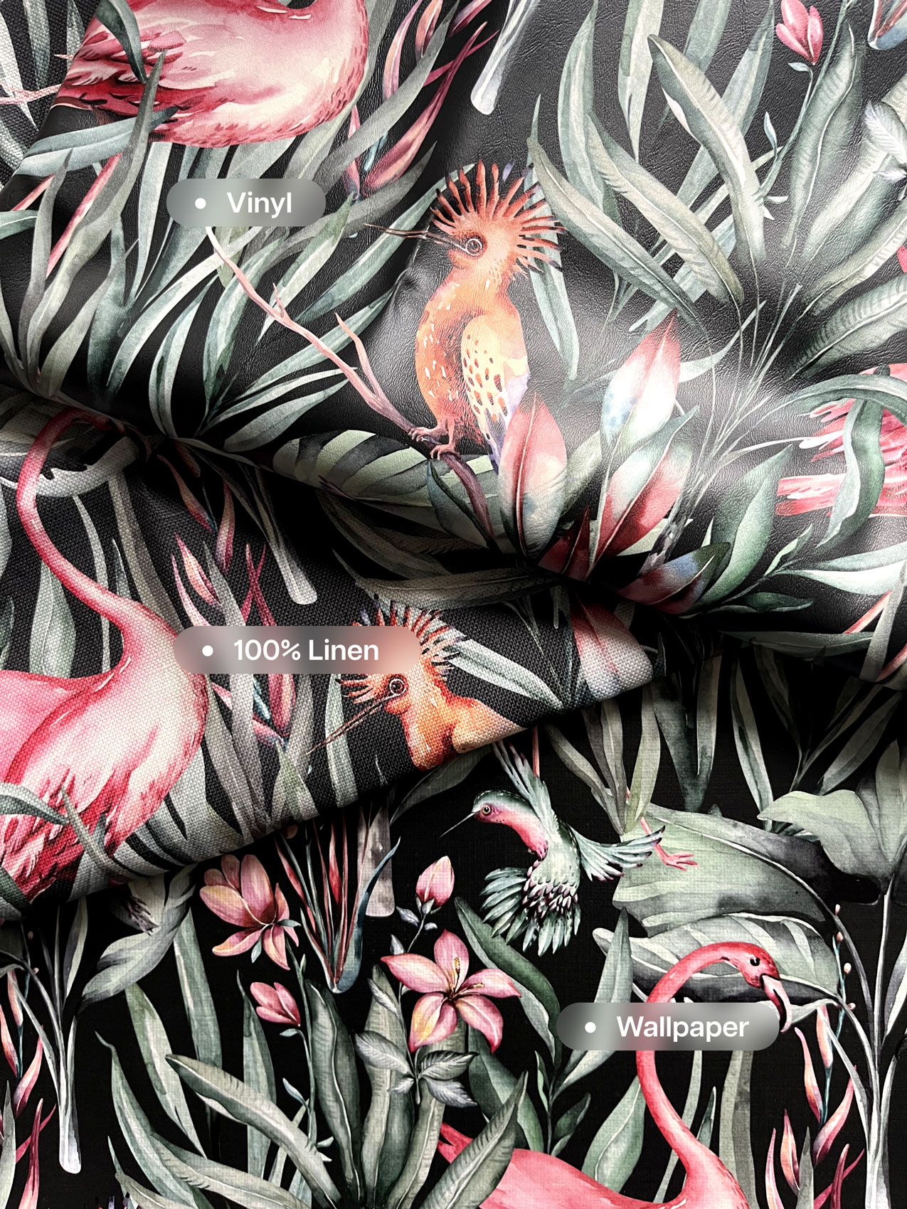
This means that whether you print a linen, or a vinyl, or a wallpaper and a polyester, they’ll come out very close in colour. While there are still some factors (like sheen) that might slightly alter the appearance, we are proud to boast a 95% colour match.
Check out the photo below for a side-by-side comparison of our Linen Look Wallpaper, Vinyl, and Nashville (100% Linen).
To experience the same colours across all of your designs, they need to be printed using the PF 2024 colour management system. Existing colours on our current system will still be available, however they will need to be moved over to PF 2024 if you want them to be consistent across the board. We can assist with this if you require it, just let us know.
Want to begin printing on fabrics, but you are not sure what print technology best suits your needs?
Reach out to our friendly team of passionate print experts at Mereton, today!